Redesigning Australia’s biggest beauty review site
beautyheaven
Redesigning Australia’s biggest beauty review site
beautyheaven
beautyheaven is Australia’s largest and most comprehensive beauty review database, combining community reviews with expert opinions on the latest trends in skin, makeup, hair, and wellness products. While the site has an active and loyal user base, it had not been updated in a number of years and over time membership growth and participation had dropped off, and as a result so too had advertiser revenue.
Our challenge — refresh the brand and site for a new audience, fix the pains of current users, and get them reengaged
Before jumping into the redesign, we wanted to thoroughly understand the beautyheaven business and its users. Taking a deep and wide approach, we conducted interviews with the beautyheaven team, as well as with advertisers, in order to understand beautyheaven’s key values and objectives for the business. We also ran a survey with the current beautyheaven users, which was met with great enthusiasm and graciousness.

Discovering what users wanted most
Armed with a deeper understanding of beautyheaven, its users, and its competitors, we set out to improve the overall experience of browsing, searching and entering reviews, without alienating existing members. Focussing on adding value for the user, while also delivering on business needs for Are Media and their advertisers.
We experimented with navigation patterns, findability, personalisation concepts, and finding new ways to integrate member-generated content like product reviews with editorial content. To validate our designs, we tested prototypes with existing beautyheaven members and people who had not previously interacted with the site across a broad age range.
Through testing, we learned what was important to members, how they wanted to interact, and the kinds of content experiences that non-members value.
Designing for a community of passionate beauty fans
To complement the new and improved user experience, a revitalisation of the beautyheaven brand was undertaken, while still ensuring it remained familiar to users.
Starting with the logo, the serif typeface was used as the foundation and evolved into a dynamic and bold logotype incorporating modernised aspects of a sans serif.
beautyheaven’s badge suite, used for reviews and their annual beauty awards, was refreshed to align with the new brand direction.
The colour palette received a refresh too, moving towards a warmer feel, inspired by the diversity in skin tones and contrasted with vibrant hues.
To add a level of depth and texture to the brand, organic background patterns were introduced. Subtle animations were applied to bring the patterns to life and draw attention to content.


From our conversations and member contributions, we learned how well-loved beautyheaven is, discovering a tight-knit community of passionate people, which is beautyheaven’s biggest strength, and what sets it apart from other beauty sites.
Our redesign needed to stay true to the experience that beautyheaven's long time members know and love, and create opportunities to attract and engage with new audiences.
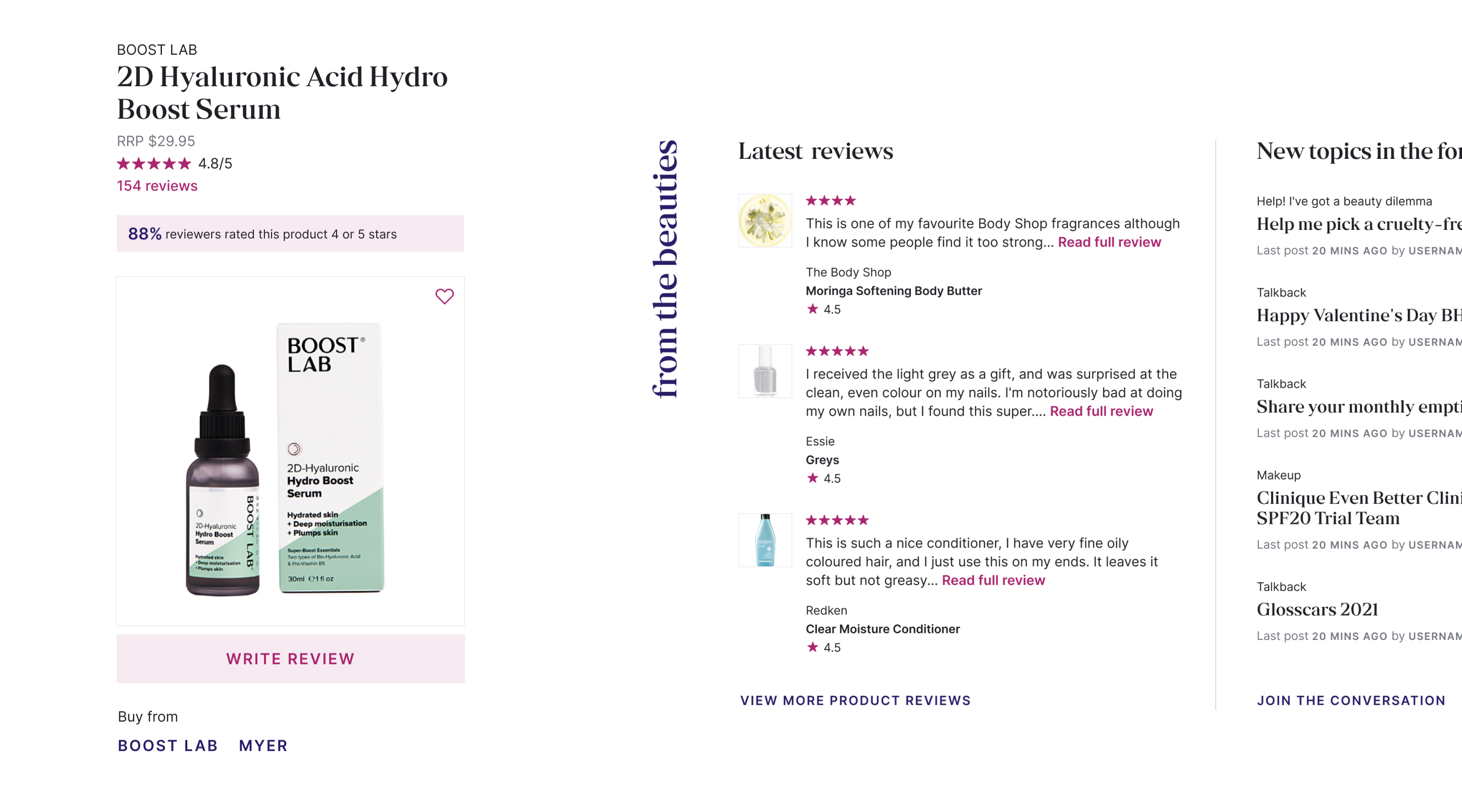
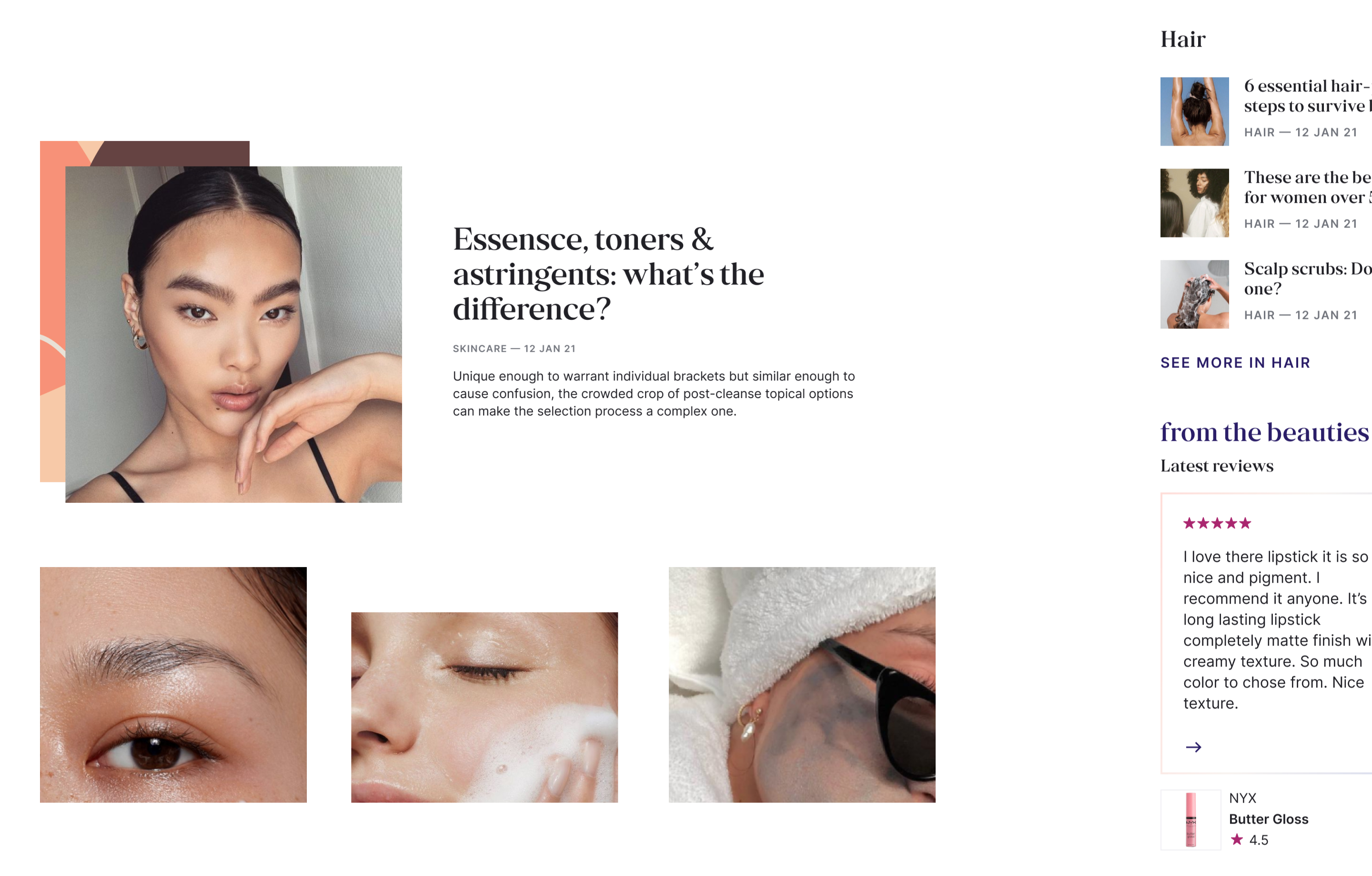
The website evolved into a cleaner and modern design with added functionality around highlighting and filtering products, reviews, and content. For the site to continually look fresh and updated, we provided the editorial team the flexibility to change up how content is displayed through changing colours, patterns and the configuration of the modules while ensuring a cohesive visual experience.