How we fix design system drift
Australian Government Treasury
Government
How we measured design system drift in three live portals, for Treasury
A design system looks its best sitting still, when every component is documented and every state accounted for. Then it ships, users start interacting with it, features get added release after release, delivery teams make calls to accommodate requirements nobody anticipated when the rules were written, and more often than not, the system starts taking on a life of its own.
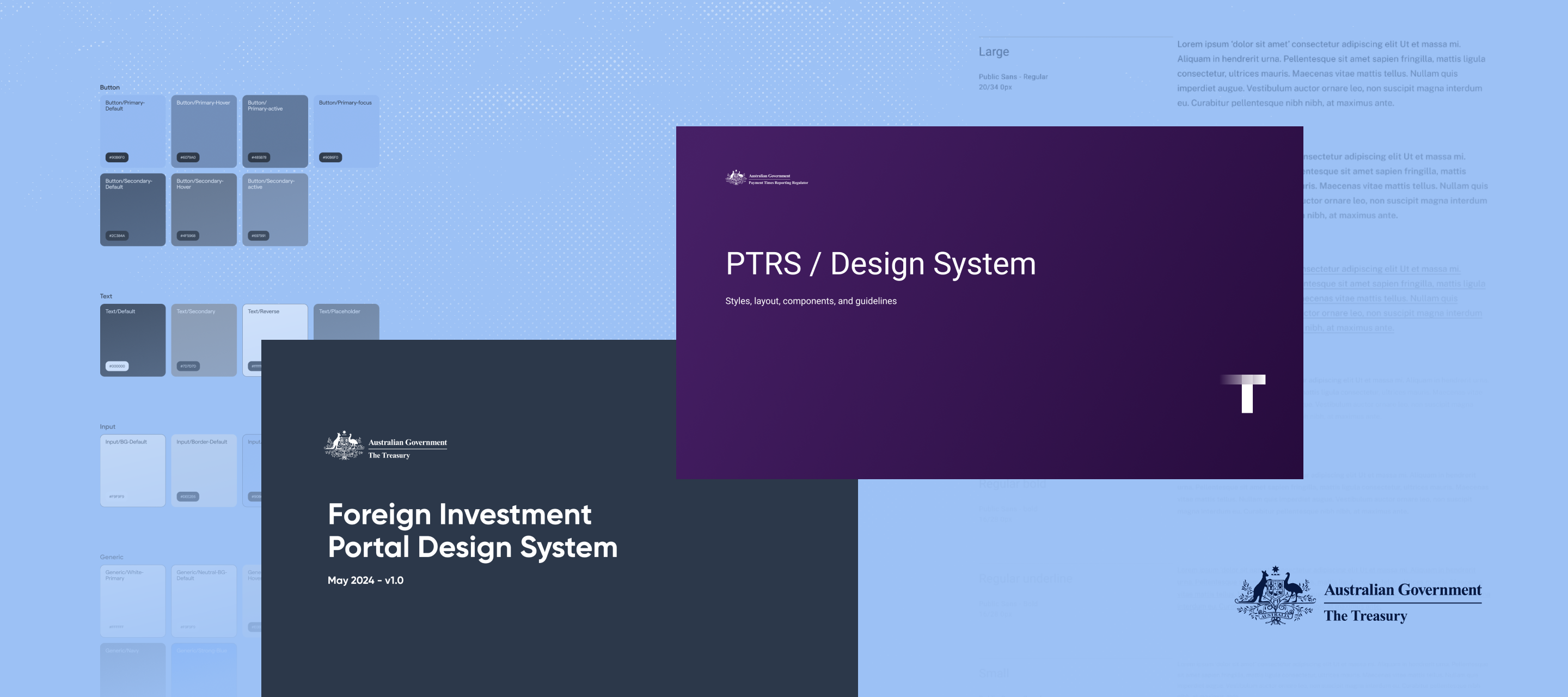
We built the design system for the Federal department of The Treasury in 2024, and in June 2026 they asked us to audit how far their three live platforms had drifted from it and to make some recommendations along the way.
Where does the drift come from?
Drift is almost never one decision that strays from the original; it accumulates over time, as the teams building and extending the product need to find ways to accommodate new requirements. In practice that looks like a field added under a new reporting obligation, a lengthy error message written by whoever was closest to the deadline, a component copied and adjusted because the original didn't quite fit the flow, and a pattern that made sense in one product carried into another where it doesn't. Every one of those calls is reasonable on its own, but taken together they pull the build away from the original design system. The people who feel that drift most are the users, who end up with a product that behaves slightly differently everywhere they look.
The Australian Treasury's Foreign Investment Portal (FIP), Consult Partner (CP) and the Payment Times Reporting Scheme (PTRS) all sit on a design system we authored in 2024. PTRS carries its own programme brand while FIP and Consult Partner are co-branded, so the system was designed from the outset to support two identities, which means some of the variation between the portals is there on purpose and part of our job was separating what was intentional from general drift.
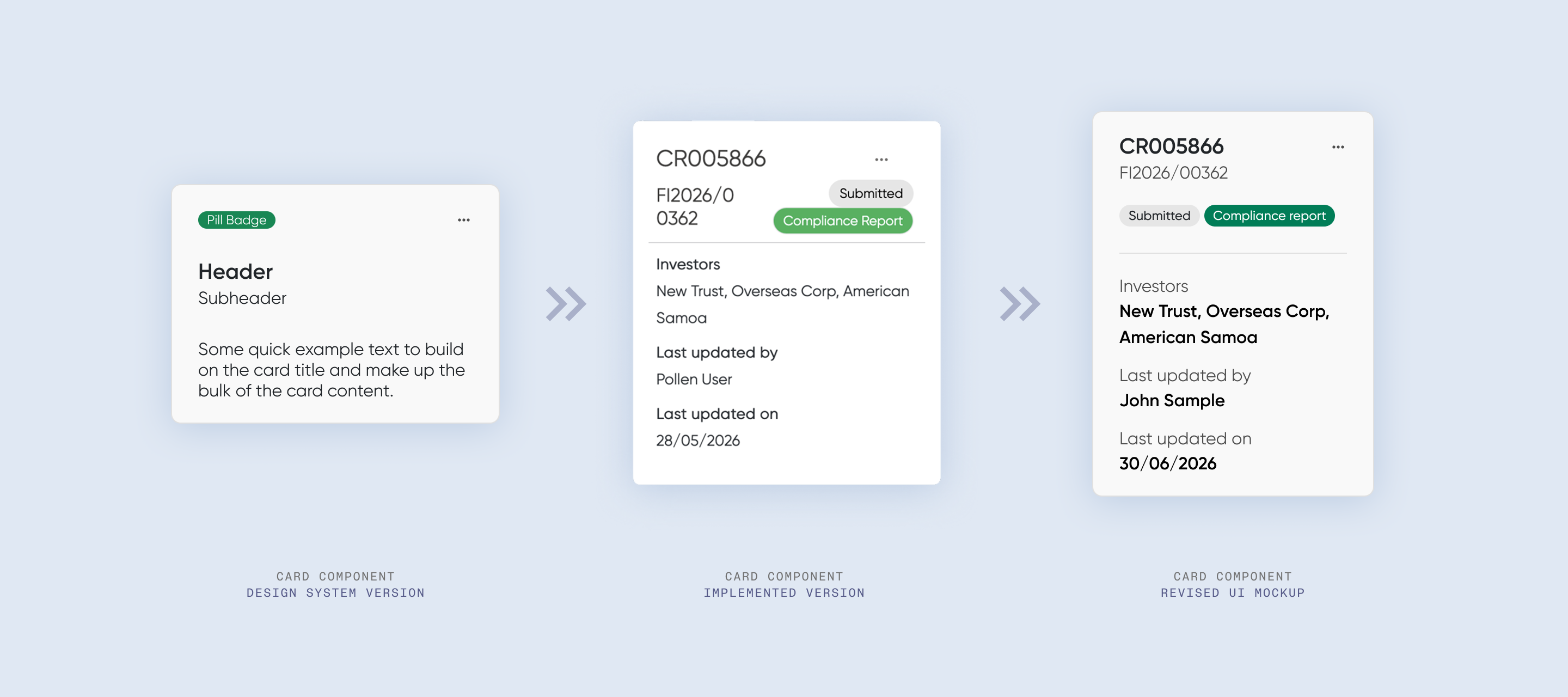
How we measured drift
We approached the brief in two halves, first by measuring the live builds against the design system we authored in 2024 to find where the two had diverged, and second by reviewing what the internal team had built since, the new components they'd added, the UI and styling they'd applied, and the patterns they'd invented to solve problems that didn't necessarily exist when the system was first implemented.
Once we had a thorough review of each platform and the current state, we graded the issues we’d found against UX best practice, WCAG 2.2 AA and the Digital Service Standard, with a severity attached to each finding so that Treasury could prioritise and triage from a backlog.
Most of the friction sat in the moments where users had the most to lose, for example, filling in a detailed, legally binding submission against the clock, and that is where drift stops being a matter of internal tidiness, aesthetics and governance and starts impeding the users and subsequently, their confidence in the service.
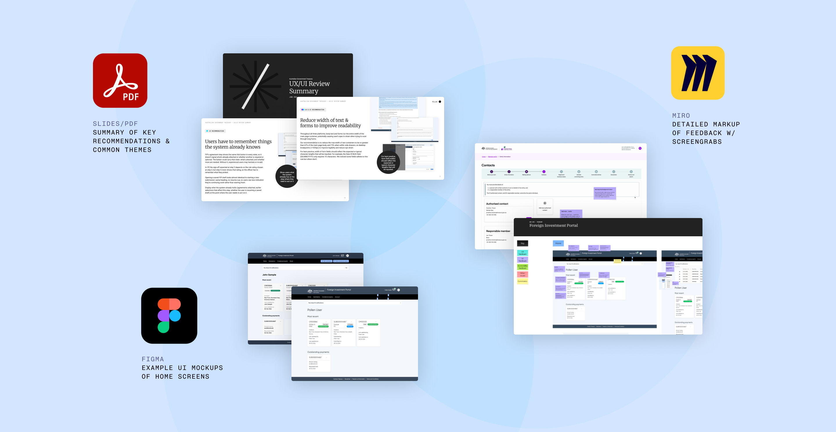
An audit only works if you have an original to grade the current build against (which is the practical argument for maintaining a design system long after launch, since it becomes the ruler you keep measuring with!). With that as our baseline, we ran the audit over six weeks, starting with agreement on the heuristic and accessibility frameworks and access to the live builds, after which we clicked through every flow we could reach, deliberately enabling each button state, form state, error state and empty state as we went. We copied the screengrabs into a Miro board and annotated each instance where we found it, noting the UX and UI issues, the opportunities we could see and how each measured against the accessibility standards. We then walked the Digital and Engineering teams through the key issues and opportunities , so we could explain each finding in detail, answer their questions and talk through the options for fixing them.
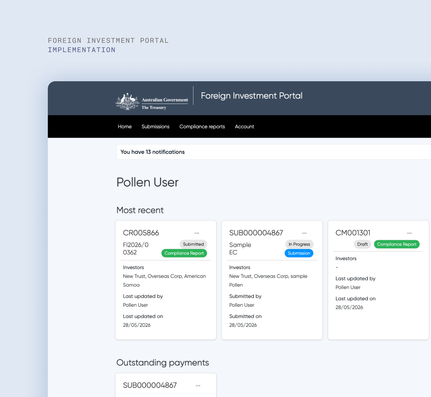
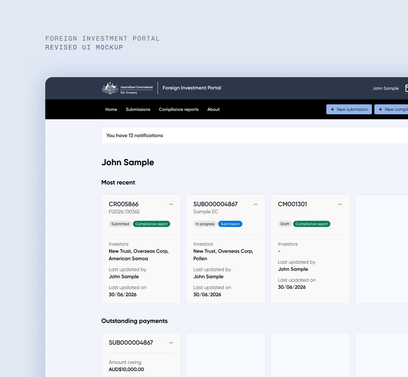
What Treasury walked away with
Treasury finished the six weeks holding a prioritised findings log covering all three portals, a written revalidation report, annotated Miro boards showing every recommendation in the context of the screen it applies to, Figma mockups of the proposed home screen treatments, and a final presentation walking each team through the critical issues and fixes that affect them.
Drift is going to happen on any product that stays in service long enough, because the requirements keep arriving and the delivery teams keep making sensible local calls to accommodate them, and a system in use is a system that grows whether or not anyone is watching it. The work is checking on it periodically, measuring it against something documented, and deciding what to correct while the correction is still cheap.
Has your design system drifted?
If you built a design system a few years back and your product has been live and growing ever since, the gap between the two is measurable and we can tell you where it sits and what to fix first. We run heuristic and accessibility reviews for government platforms - the Department of the Treasury, the National Gallery of Australia and the NSW Department of Customer Service among them and we bring the same care whether or not we wrote the original system.
Get in touch and we'll talk through what a review would look like for your service.